Jul 03 , 2021
Creating accessible products means most of all being aware of the usability issues your designs and code can cause. When creating new products, Microsoft follows a strict workflow of accessibility reviews of designs, code reviews and mandatory audits before a new feature can leave experimental stage.
Microsoft Edge is no exception. Even if users spend most of their time interacting with the web content itself (which the browser can’t really do anything about) they also interact with menus, options, settings pages and more that are part of Microsoft Edge. These parts of the browser need to be accessible to you whether you use a mouse or a keyboard, or whether you rely on a screen reader to interact with your computer.
The Developer Tools are part of the browser, and as such, need to comply with the same accessibility guidelines. This includes new features but also legacy features that have been around for years in the Chromium codebase.
In order to make time to fix issues, we have so-called bug sprints, where we focus two weeks on fixing broken issues rather than adding new functionality. We just finished a bug sprint focused on accessibility issues and today we want to share how we fixed a problem that has been around for a long time.
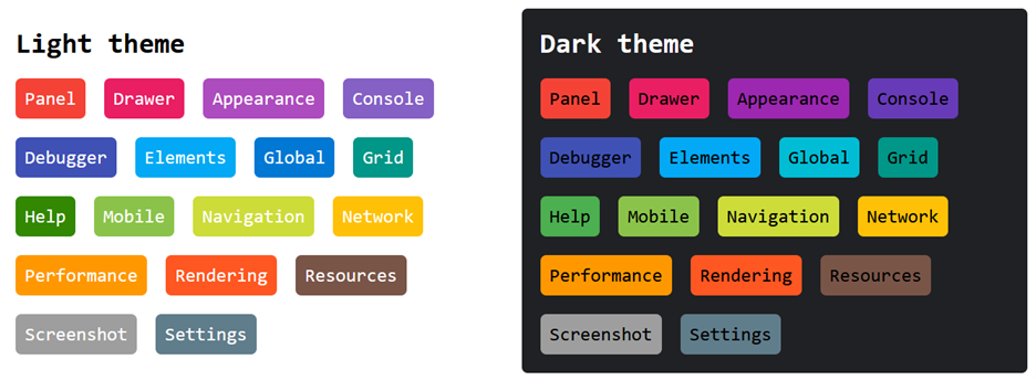
DevTools has a fairly complicated user interface, and it uses a lot of different colors, to make differences in content more obvious. One example of which is the command menu: